A dotted sphere mark for Vetnis, a hydrogen energy brand
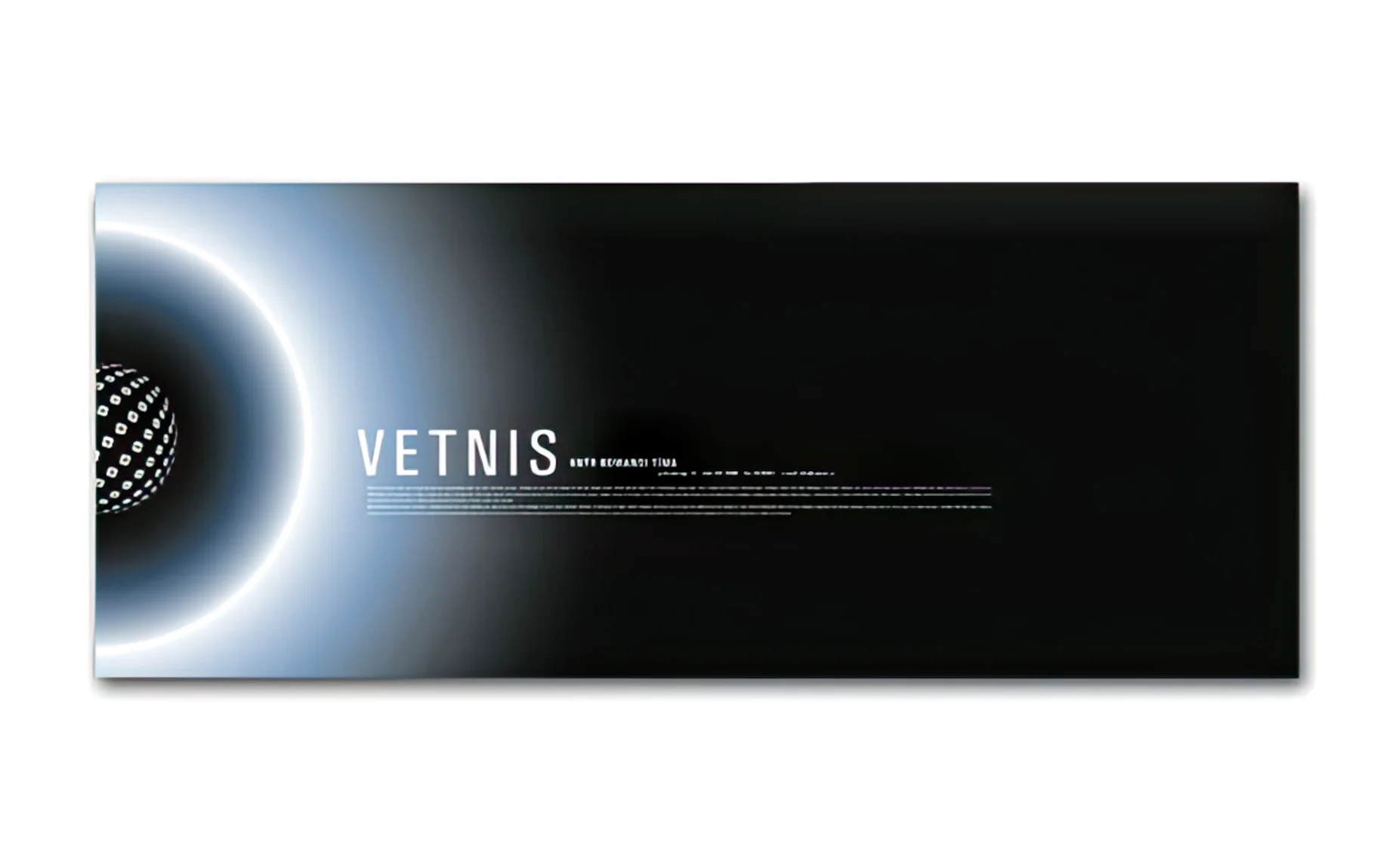
Vetnis (vetni is the Icelandic word for hydrogen) needed an identity concept that felt technical and forward-looking without leaning on the clichés of green-energy branding: no literal leaf shapes, no obvious water drops.
The mark is a sphere built from a repeating dot pattern, arranged so the dots thin out toward the edges and give the shape a sense of dimension and motion, paired with a plain, wide-set wordmark and the tagline "Force of the future."
Because a brand like this needs to work on a screen as much as on paper, the concept was tested first as a mockup, the mark glowing against a dark, almost eclipse-like backdrop, before being reduced to clean dark and light logo versions that could sit on a business card or a spec sheet just as easily.
The dot pattern was the part that had to survive every version. As long as that held its shape, the mark could move between a moody screen application and a flat, printable logo without losing what made it recognisable.