Designing the finisher medal for the Reykjavík Marathon
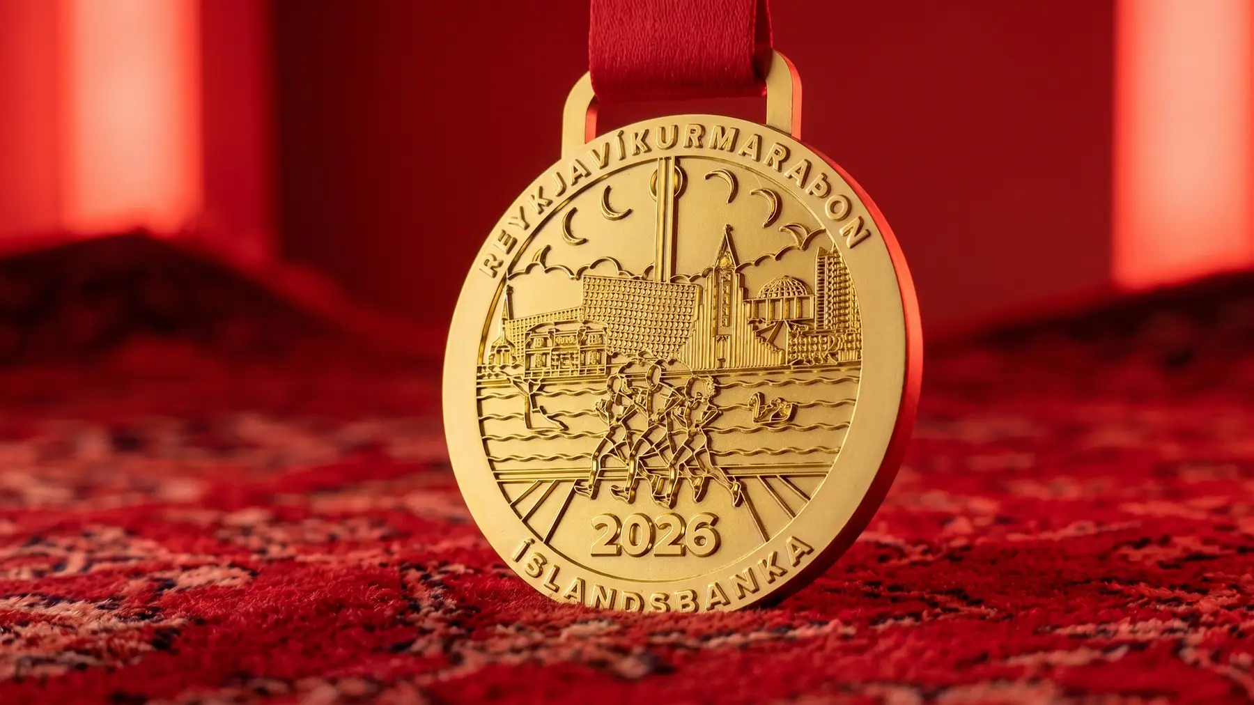
A finisher medal has one job most sports medals get wrong: it has to be something a runner actually wants to wear once the adrenaline wears off, not just proof they crossed a line. That was the starting brief for the Reykjavík Marathon medal, a design that felt like the city, not like a generic laurel-and-ribbon trophy.
The concept came from the race route itself. Reykjavík Marathon runners finish along the harbour front, with the city's low skyline framing the water behind them. I sketched that skyline as a simple silhouette, a shape that could sit on a medal at a few centimetres wide and still read clearly, without needing colour or detail to carry it.
From there the mark had to work at very different scales: stamped into a medal, printed on a finisher t-shirt, laid out on a runner ID card, and used on the pep-station maps volunteers hand out along the course. Each application meant simplifying the same skyline shape further, until it held up as a single flat icon as well as it did as a dimensional medal.
The test for a project like this isn't a brand guideline, it's whether someone keeps the medal on a shelf. Keeping the identity this tightly built around one recognisable shape, the skyline against the water, was what made that possible.