Building a brand system for URBAN's cube-pattern identity
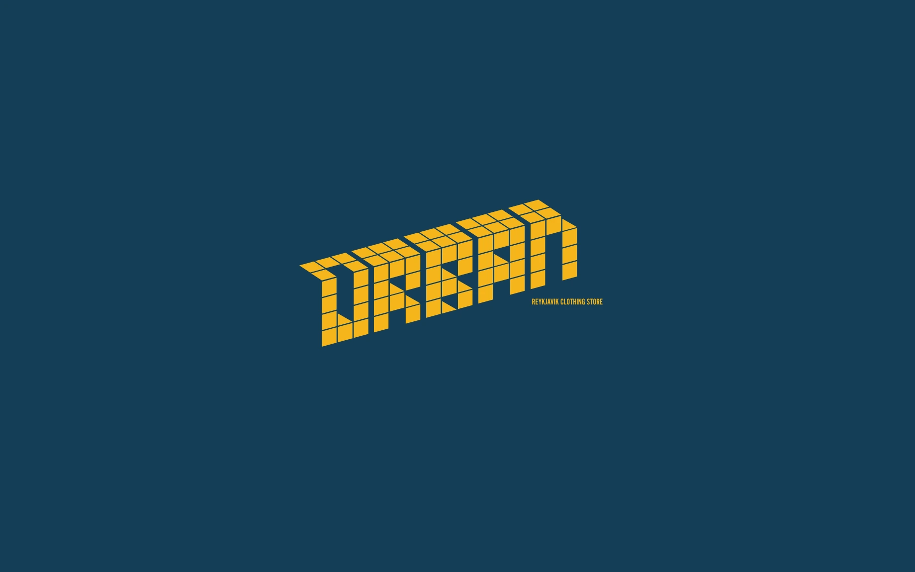
URBAN, a clothing store in Reykjavík, needed a brand identity flexible enough to move between a clean retail shopfront, streetwear-style motion content, and printed materials, without ever looking like three different brands wearing the same logo.
The solution was built around two connected pieces: a cube-pattern logotype and a skyline-referencing wordmark, both constructed on the same underlying grid. Because the geometry stayed constant, the system could carry very different colour treatments, a yellow version and a white version, without the mark itself needing to change.
Motion was part of the brief from the start, not an afterthought. Having the identity built on a strict cube grid meant the mark could be animated by rotating or rebuilding the cubes rather than needing a separate motion concept bolted onto a static logo. The logo and the motion piece came from the same geometry.
What made the system hold together across colourways, print and motion wasn't a long list of usage rules. It was keeping every version traceable back to the same grid. If a variant couldn't be built on that grid, it wasn't part of the system.